January 23, 2025
3 minutes
poor presentation quality
research presentation tips
slide design for insights
market research storytelling
effective data visualization
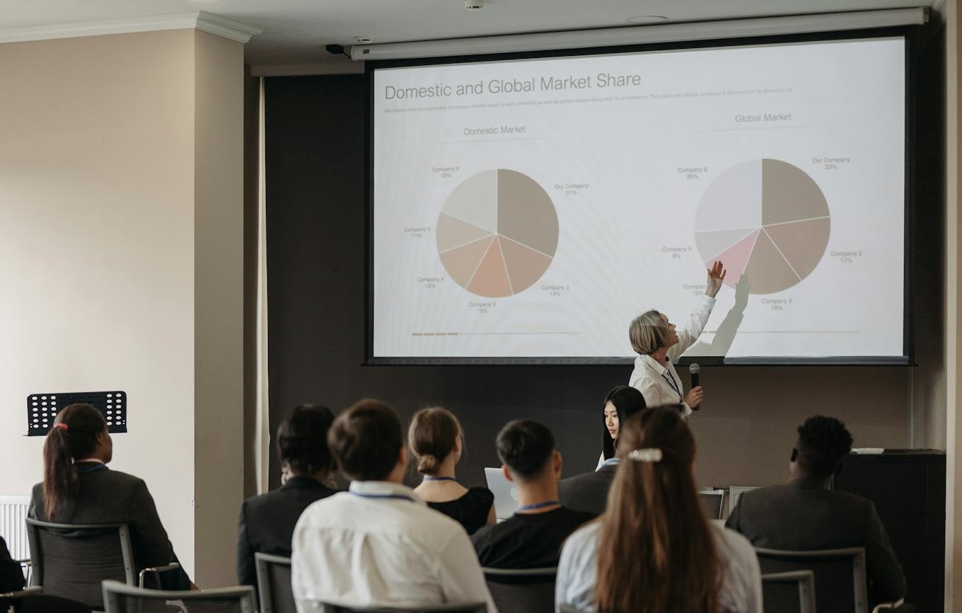
Picture this: your team invests weeks gathering data, analyzing it, and crafting the perfect insights. The findings are gold—relevant, actionable, even a bit surprising. But then the moment of truth arrives: the stakeholder presentation.
And… the room disengages.
Boring slides. Poor visuals. Confusing structure. No narrative.
The hard work is buried under walls of text, unreadable charts, and a delivery that feels more like an obligation than a revelation.
At DataDiggers, we’ve seen this scenario play out across industries. And we get it—translating research into impactful stories is hard. But poor presentation quality doesn’t just dilute the message; it can derail decision-making, erode trust, and undermine the strategic value of your research.
Let’s break down what causes it—and how to fix it.
A poorly structured research presentation does more than frustrate viewers. It risks:
Research presentations should be decision-making tools, not data dumps. But that’s easier said than done.

1. Research Fatigue
By the time results are in, researchers are already stretched. The presentation becomes an afterthought, rather than part of the insight process.
2. Data Overload
Too many slides try to show “everything” instead of filtering for what matters. This overwhelms the audience and distracts from the message.
3. Weak Storytelling
Without a clear narrative—what happened, why it matters, what to do next—insights fall flat. The audience can’t connect the dots.
4. Poor Design Skills
Even excellent researchers may lack the design training to create slides that look professional and intuitive.
5. Template Tyranny
Rigid corporate templates can stifle creativity, forcing researchers to prioritize compliance over clarity.
Sound familiar?
1. Start with the “So What?”
Begin by identifying the key message. What is the most important takeaway for your audience? Build the story backwards from there.
2. One Slide = One Idea
Avoid cramming too much into a single slide. Each visual or text element should serve a specific purpose, or it’s just noise.
3. Make Data Visually Intuitive
Use clean, relevant charts and avoid visual clutter. Label clearly. Highlight what matters. If the audience has to work to understand the chart, the slide has failed.
4. Structure Like a Story
Follow a logical flow:
5. Design for Impact, Not Decoration
Avoid unnecessary animations, generic stock photos, or decorative charts. Simplicity, contrast, and white space are your allies.
6. Know Your Audience
Executives need clarity. Marketers need implications. Product teams want granularity. Tailor accordingly.

7. Practice the Delivery
Even the best slides fall short if poorly delivered. Know the story, anticipate questions, and be ready to guide the discussion.
High-quality presentations aren't just about aesthetics—they’re about communication clarity. When done right, your research becomes a powerful force for strategic alignment, innovation, and customer understanding.
At DataDiggers, we help clients do more than collect insights—we help them communicate insights. Our platforms, like Brainactive, offer built-in tools for crafting presentation-ready reports with real-time visualizations. Whether you’re preparing for a client meeting or a boardroom pitch, we can help ensure your data doesn’t just speak—it resonates.
For projects that rely on large-scale simulations or advanced data modeling, our Correlix solution ensures the synthetic data behind your visuals is statistically robust, privacy-safe, and highly realistic—so you can tell smarter stories, backed by better data.
If your team is ready to elevate the way research is presented and received, we’d be happy to show you how.
Let’s turn your next presentation into a moment of impact. Get in touch with us to learn more.
Download The Hidden Markets Report — get faster, higher-quality insights.

